Qpercom as a digital assessment company with enormous student information can provide our clients with analytical and logical insights about various aspects in the OSCEs and MMIs. Our existing analytics platform provides the client with a detailed statistical summary of the exam including but not limited to a bar chart of mean marks obtained by the students, number of pass or fail, a radar chart with various competencies based on which the students are evaluated.
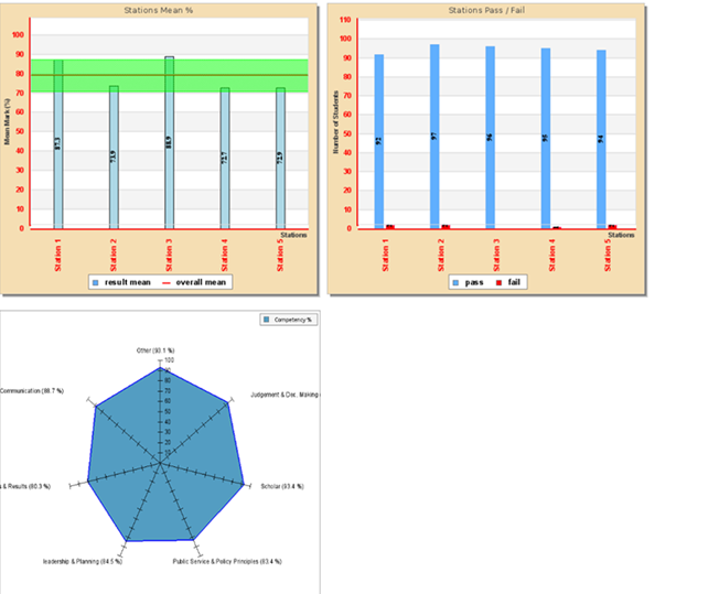
The above picture is the current dashboard available in observe, we decided not to limit our self to these graphs and let our clients control their data and interpret them as per their need. Hence driving us to one of our main reasons to provide the clients with an interactive dashboard.
Why we need a new integration
Integrating a strong data platform like Google Chart Api or chart.js can be a major update to our product enabling clients to work around with their data with a enhanced dashboard making the boring bar chart look interesting. The current version of observe supports a static visualization of various parameters but giving the clients an interactive dashboard will definitely be a game changer. Google charts and charts.js have been a really powerful tool for achieving this
Google Chart API
Google Chart is a free to use, simple, powerful tool providing users with a fleet of interactive charts and graphs. It is backed by javascript making it highly integrable. It is backed by the google cloud platform and has detailed illustrations and documentation. Google charts comes with a vast variety of charts and graphs to work.
Charts.js
Chart.js is a lightweight, fast tool to implement responsive charts. It’s a very easy tool to embed into the application and customizable. The documentation is well managed by the community and provides detailed illustrations on using all the features
A proposed dashboard model :

The proposed dashboard will look something like in the above image, giving the clients an interactive dashboard including features like hovering option to prompt more information, slider to view data for different departments or year.
What we can provide the clients
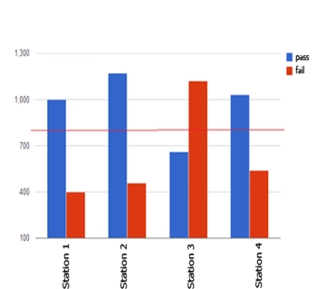
Integrating the interactive chart api can change the existing graph observe offers


The above apis changes the overall visualization making it look more visually appealing and interesting. Hovering over the chart provides detailed information. There are other types of charts which we can use to provide different perspectives of the data.
Why not add some animation ?
The google chart api and chart.js support animations making the dashboard more interactive. This enables the client to view changes over the course of years or department, giving them comparative analysis of the performance of the students or the interviewees.The progress bar option in chart.js can be used to show the performance of the students among different stations or the performance of the interviewee between different rounds. The link shows a demo of the graph
Conclusion
Hence integrating the google chart api and chart.js will definitely be a major upgrade for our clients and we at qpercom are working towards delivering it to them, adapting every possible solution which will benefit our clients.

